Space Delivery Guy is a top-down shooter with a cargo management element.
Drive your ship through pirate-infested routes using your packages to defend yourself,
but be careful not to destoy them!
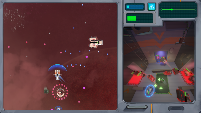
The game screen is divided in two parts: the Space Section, where the player drives their
ship to avoid or destroy enemies, and the Cargo Section, which shows the effects of the
ship’s movement onto the packages.
The player controls only the Space Section directly, while the Cargo Section is affected
by the movement of the ship. Inside of the cargo hold, placing certain coloured packages
onto the corresponding platforms will grant a defensive or offensive upgrade to the ship.
I was one of two game designers working on the project. I contributed to the game as a
whole (concept elaboration and gameplay development, writing and updating the GDD, testing),
but I mainly focused on designing the packages, Cargo Section, and UI/UX.
As team leader, I also organised the team, determined and assigned tasks, and kept weekly logs
of feedback and goals.
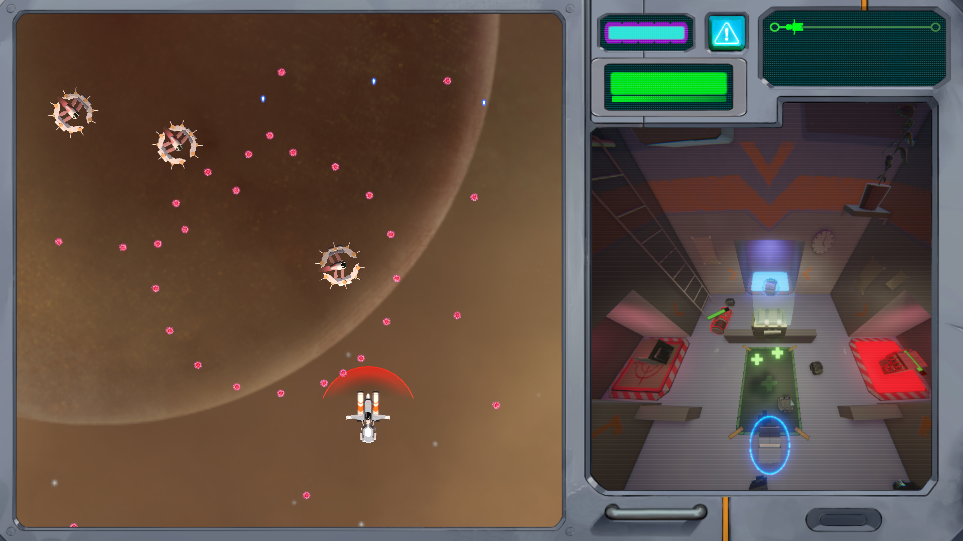
The Cargo Section, along with the packages inside it, is at the heart of the concept. They must receive part of the player’s attention at all times, and they set SpaceDeliveryGuy apart from other space-themed top-down shooters. For these reasons, we wanted them to be an integral part of the gameplay, interesting and fun to interact with, but also clear and intuitive.
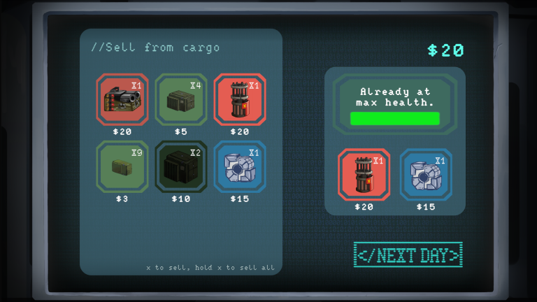
Packages come in three types: green, red (which can activate the player’s cannons), and blue
(which can recharge the player’s armor). HP and weight vary depending on the type and size,
but all will be damaged by crashing against the walls of the cargo hold or each other.
At the end of each day, the player can earn money by selling their packages: this encourages
the player to care for their cargo and avoid risky manoeuvres that would destroy their packages.
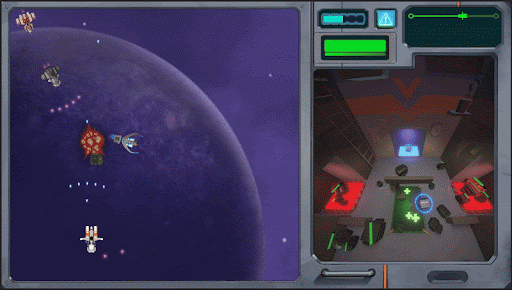
Multiple packages can be active at the same time, with red packages granting different kinds
of shot depending on their shape and allowing for different pattern combinations.
The player is thus motivated to seek out more packages and hold on to them even when they
already have one of each type.
Especially on harder levels, packages will break regularly for most players. To mediate this,
and ensure that the player always has at least some healthy packages inside their cargo hold,
random packages can be found floating in space or dropped by destroyed enemies, ensuring an
almost constant turnover.
During any playthrough, packages will be moving around a lot inside the cargo hold: the different
colours and shapes make them immediately recognisable at a glance, even in the middle of the action.
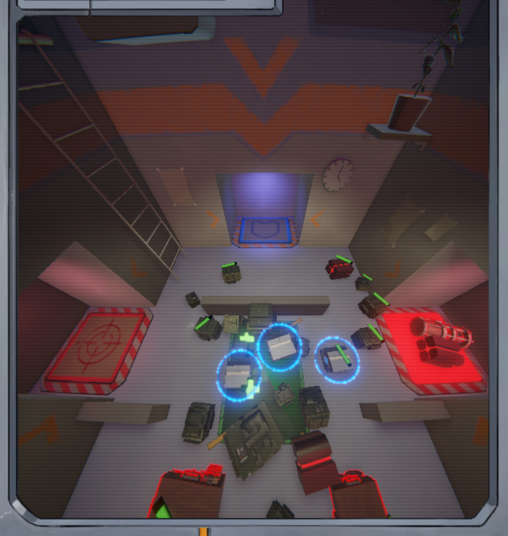
In designing the cargo room I experimented with a few different shapes and layouts allowing for
different interactions between it and the packages. We settled on a simple and readable layout,
with every platform being reachable at all times: two red platforms (which activate shot packages)
at the sides of the cargo hold, giving the player many opportunities to use them even when moving
around quickly, and one blue platform (which activates armor packages) at the far end, rewarding
a daring player which pushes forward with a defensive boost.
At the center is an area which heals any packages that enter it, enhancing the overall durability
of the player’s stock. A few short walls were later added after testing, sectioning the floor
space to help the player break up groups of packages and guide them to the intended platforms.
The cargo hold is an essential part of the player’s interaction with the packages, but it must
not distract from them: for this reason, it’s spacious and plainly-textured, moody but unintrusive.
The platforms glow when active, making them stand out from the rest of the scene and clearly
indicating the status of the player’s upgrades.
I closely worked with the Concept Art department to develop the game’s visual interface.
We wanted it to further enhance the chosen setting and artstyle, based on retrofuturism and the
series Cowboy Bebop, but it also needed to communicate a great amount of gameplay information
in a clear and concise way.
To contribute to the game’s unique identity and keep with the stated visual inspirations,
we wanted the UI to feel like a physical object, like the ship’s control panel itself.
As such, some of its elements emulate analog knobs and buttons, and all digital items such
as health bars are presented on tiny displays, rather than abstractly superimposed on the interface.
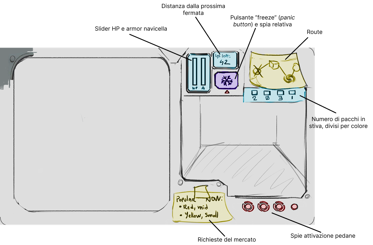
Initial HUD sketch
The main HUD had to be split into two screens, one for each part of the core gameplay
(Driving and Cargo Sections). We decided on an asymmetrical split, as the simplified design of the
Cargo Section required less space to be clearly readable. The initial layout for the HUD
attempted to convey too much information, which made it appear cluttered and confusing.
To solve this, some non-essential mechanics were cut, and other UI elements were incorporated
into the game scene. For example, the indicator for the active platforms, initially a series
of lights and symbols, was replaced by the platforms themselves lighting up upon activation.